Color Chronicles: Paolo Veronese Green
13 Share TweetItalian Renaissance painter Paolo Caliari, more known as Paolo Veronese, is not just known for his iconic paintings of religion and myth, but also for his unique naturalistic use of palettes. Becoming one of the most celebrated colorists known to man, one of his famous colors was the Paolo Veronese green.
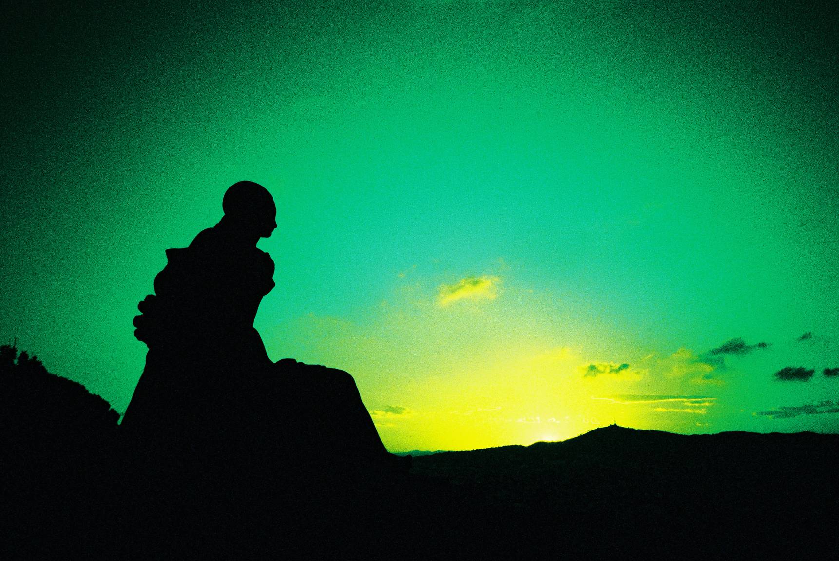


The Paolo Veronese green is a viridian with darker tinge and is more reminiscent of blue-green. The Independent supposed that its bluish properties may have come from the azurite mineral, which the famed artist used extensively. It is thought that the name was first coined around the 1800's.
Writer Melanie Renzulli of Italoflle magazine cited Roman historian Livius’s Notes on how the shade came to be:
"From Titian, he had borrowed the technique of tonal variation of the colors, in the order to achieve a soft chiaroscuro and the juxtaposition of complementary colors, to allow these to exalt each other – for example, in some paintings, he matched the Reds to the Greens… A painting by Veronese where is clearly visible his use of complementary color harmony is the Cena Nella Casa di Levi (The Feast in the House of Levi) of 1573. I and my wife saw it last year, visiting the Gallerie dell’Accademia in Venice. It’s a huge painting (5.55 x 12.80 mt), which occupies the whole end wall of a hall. Its visual composition is divided into three vertical bands, highlighted by three round arches, supported by Corinthian capitals. It stands out here the harmony of Reds and Greens, indeed it’s clear that, when Veronese wants to highlight a character dressed in red, stands next to it something green and vice versa."


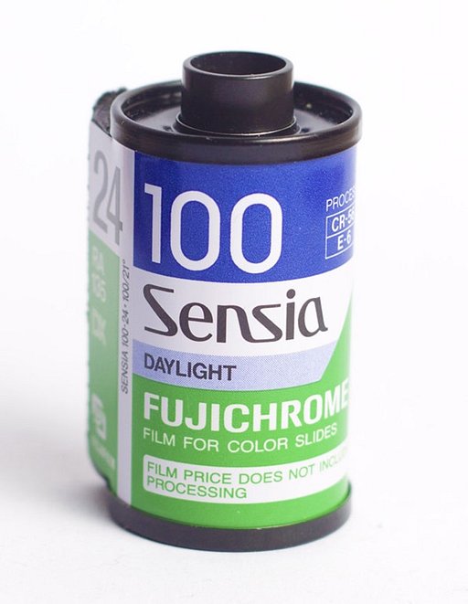
In the contemporary world, the color's name can be found in a dictionary by Rosa Galiego and Juan Carlos Sanz — Guía de coloraciones (Guide to colorations), which is a popular reference among the Hispanophone art realm. Just like the particular viridian in the Venetian artist's The Feast in the House of Levi, you can achieve this green in photography by mixing your blue and green filters — just make sure to use an additional green filter in the mix. Take into consideration the effect of these filters on your exposure, you might need to overexpose or push your film to compensate for the lack of light. We recommend using a film like the Lomography Color Negative 400 plus the filters to create your own Paolo Veronese Green masterpieces.
Challenge yourself by capturing the Paolo Veronese green in Lomographs! Don't forget to share them on your LomoHome.
2018-09-19 #culture #color-chronicles #paolo-veronese-green


No Comments