A Wild Adventure Into Cupric-Solarizations with Quinn Balazs
3 9 Share TweetWhen we came across Lomographer Quinn Balazs' (a.k.a. @qbalazs) latest work, we were intrigued and fascinated by his craftsmanship. Completely captured by this, we had to ask some questions. As we all know, processing and printing negatives require a great deal of precision, patience, and time. With this in mind, we talked to Quinn and he gave us a full breakdown of this incredible process.
Hello, Quinn! Welcome back to the Lomography Magazine! We are happy to have you talking with us again. Many photographers get scared about color processing and they mostly avoid working with those chemicals. What was different for you?
Ahh, yes. C-41 and C-22 are finicky beasts to handle. I can completely understand people being scared off by a process where half of a degree in temperature difference could ruin you. From a very young age, I've been working with color chemistry. So I suppose that plays into why I'm not too terribly afraid of it. C-22 is a much more difficult process to get right than C-41, C-41 succeeded C-22 and simplified the game a whole lot. Bleach and fixative in one step, generally only one developer to mix up. But I do understand people being wary of color processing. It was definitely different for me, probably because I shot my first color roll somewhere around 14 years of age. I was guided through the process by an excellent mentor.
"Everything was a challenge, and honestly I spent way more time thinking about it and enjoying it because it was a challenge. I basically produced a whole new form of photo paper in my basement, producing a novel development process for polarization."
What is the process that you feel most comfortable working with?
Black and white, there's absolutely no question there. I'll do the weird stuff like C-22, but I shoot primarily black and white and develop primarily black and white. I've used just about every developer in the book from diafine/acufine to Ilfosol-3 and D-76. B&W processing is more forgiving than color and certainly less finicky than color. If you were to take a look in my film cabinet, you'd find some E-6, some C-22, some C-41 and a tremendous amount of B&W. I absolutely love Potsdam Kino, it's one of my two go-to's, the other is Ilford Delta 400 Professional. I do process E-6, it's a royal pain, but the transparencies in my eyes are worth it. I have a mixture of 120 and 35mm film in my cabinet. I am the most comfortable processing Black and White. Because I've done it a thousand times, because color chemistry is more expensive, and because I like the way the world looks frozen in shades of gray.
Which one is the one you would suggest to a newcomer in developing practice?
For a newcomer, I'd definitely recommend starting with Black and white, getting a couple of rolls of Ilford HP5+ (it's a terrifically forgiving film), and buying D-76, Kodak Rapid Fixer. D-76 is a forgiving developer to start with, not too great with slower films, but it works. Kodak Kodafix is what I've always used as a rapid fixer for film and paper. There's no reason to buy a stop bath when you can mix vinegar with distilled water. There are two other chemicals that I see as needed that some people might argue they are not. Hypoclear, to shorten wash times and a wetting agent in case your water is hard. I'd recommend they buy a gallon of Instant Ocean to wash in as that cuts wash time by about half. So, I'd recommend wholeheartedly that someone start with the elementals, and here the elementals are black and white processing.

Now let's talk about your work on the cupric-solarizations. Can you tell us about the process?
So to get to the cupric-solarizations we have to take a walk through both the Van Dyke and Cyanotype process as well as the process for ordinary silver gelatin prints. I went wrong in trying to create this process more times than I can count, I'll work through my thought process a bit here. We start with the failed cyanotype-esque approach with some manner of cupric ammonium citrate created using a Chinese process for creating it for fertilizer use. For all chemistry, let me just quickly note everything is by mass unless otherwise noted.
For this attempt, I mixed 100gm water, 12.5gm sodium citrate, 17gm copper sulfate, and 30gm of ammonium hydroxide to generate cupric ammonium citrate. I ended up with a solution that was light-sensitive to a point, but only to a point. Nothing really distinguished itself in the print, shadows were muddy on highlights. This process also used Cuprous potassium cyanide, which unlike Potassium ferricyanide is bioavailable as a toxin, and is very toxic.
The use of cuprous potassium cyanide was enough to make me move away from a "Cyanotype-esque" approach plus the lights and darks weren't distinguished enough for the print to be of any worth. We then take a walk by traditional silver gelatin processing and I get the idea of using copper halides as silver halides are light-sensitive and silver nitrate is used to precipitate them. We wander by Van Dykes and get silver nitrate too. Of course, what I was going for was a copper print, so ideally I'd use copper halides and copper nitrate. This is where it gets technical and I'm not going to disclose ratios of those copper halides that are light sensitive. We visit the world of silver prints where halide doped paper is coated with silver nitrate and sodium chloride to make silver chloride which can copy and is light sensitive. If the evolution of this process to this point seems non-linear it is because I think non-linearly, and develop ideas not in a straight line all the time.

The first item of business, create a medium by which copper halides can be suspended and applied to paper that is still permeable to the solution. Much like sliver, gelatin became a very useful element in creating something to suspend the halides in. I brushed a medium of copper halides suspended onto a piece of spare paper just to test it out. Let that dry. Thought about the next phase, which in silver gelatin prints is the silver nitrate and sodium chloride. This led to the purchasing of a bunch of copper nitrate and dissolving it into a solution for application to the paper. So, so far we have the paper with copper halides in suspension and coated in cupric nitrate.
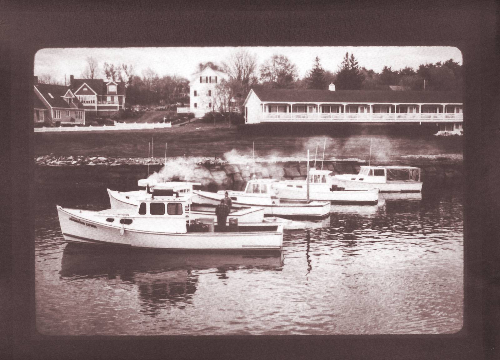
So at this point, I was decently sure I could print an image, what I didn't know was how to develop it. I was decently sure that the halides would precipitate in the presence of the cupric nitrate. What I had no idea of at this point was how to develop the latent image. I decided I'd process it through as a B&W negative, so Dektol, stop, Kodafix, Hypoclear, rinse. This resulted in a very weak image, but an image. Which delighted me. I then thought that either I was underdeveloped, over-fixed or both. I increased the time in Dektol, cut the fix time, and still got a very weak print. This made me sit and think for a couple of days, figure I had to be underdeveloping and figure hydroquinone and metol weren't enough. Everyone knows the most powerful, and potentially hazardous developing agent out there, I had to get my hands on pyrogallol in decent concentration. I decided I had to use Kodak D-1, which I had the formula for and if D-1 couldn't produce a print, nothing was going to and the process was a failure. I processed the first print in D-1, fixed normally, and got a fantastic (brown) gelatin print. So that's how we got to where we are today with the cupric print, it's a gelatin print, developed in pyrogallol but it's copper instead of silver.
What was the most challenging step of all and did you encounter any issue?
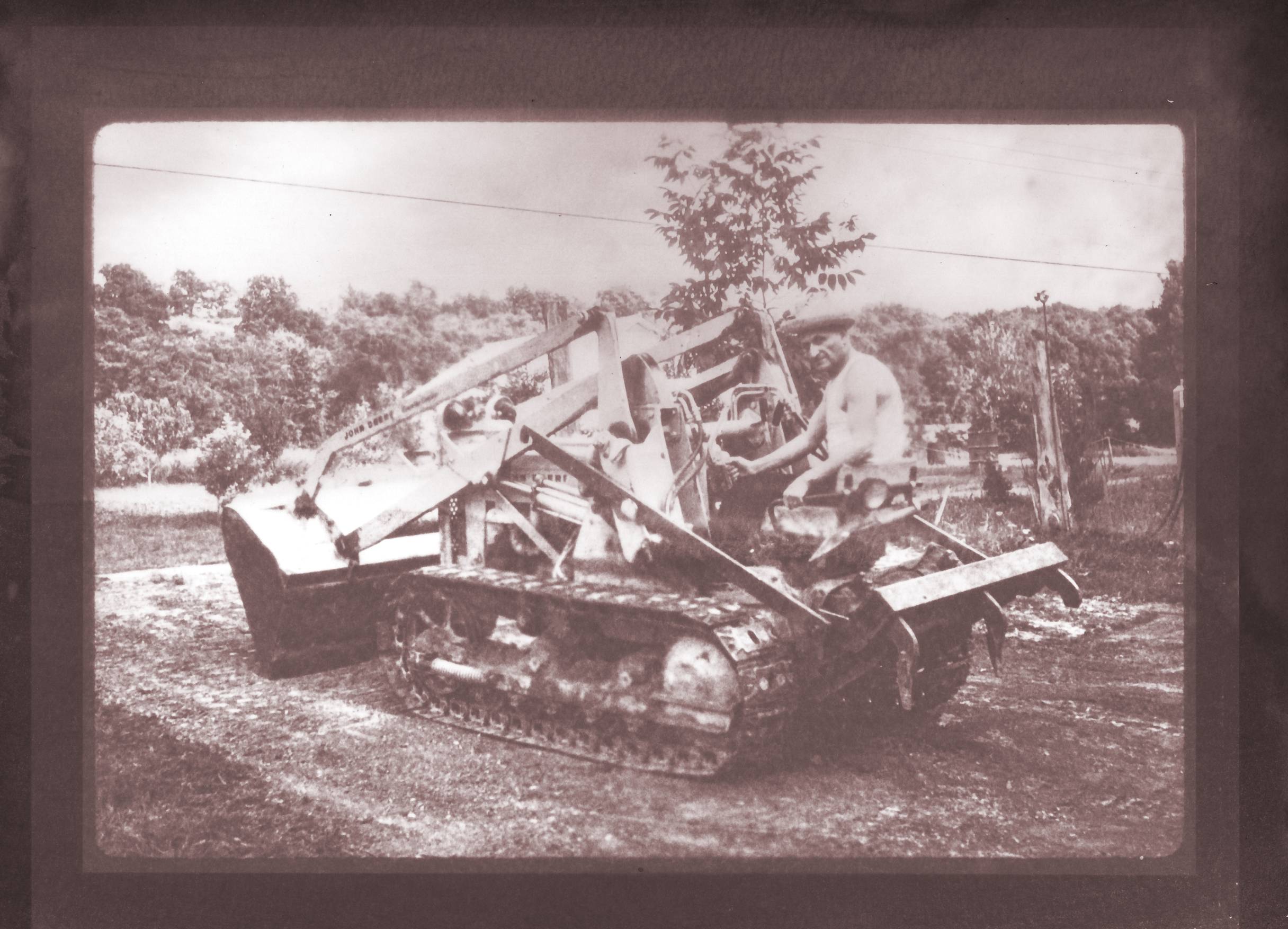
Oh dear, the whole thing was a challenging part. From almost giving up with cupric ammonium citrate and cuprous potassium cyanide not producing anything other than toxic waste, to the struggle of creating a medium to suspend copper halides in, to the struggle of developing the print. Everything was a challenge, and honestly, I spent way more time thinking about it and enjoying it because it was a challenge. I basically produced a whole new form of photo paper in my basement, producing a novel development process for solarization. There was nothing that came readily or easily here. Everything was a guess based on some common assumptions.
You worked on different processes with the same images. Which one is your favorite and why?
Gosh, this is like asking me to pick my favorite child haha. Well, if I were to choose my favorite based on what challenged me the most, which is sometimes how I pick my favorite thing this cupric process was by far the most challenging. If I were to pick what I enjoyed doing the most, I'd still pick this process, while it was a guessing game and often confounded me, I really genuinely enjoyed it. It wasn't like the mercuric process I will never do again due to inherent toxicity and complexity. This has the inherent complexity without toxicity. While I do hold all used pyrogallol and fixative as hazmat per legal guidelines, it's not like anything is really dangerously toxic. The easiest process is undoubtedly either one of the photosensitive dye processes or the cyanotype process.
Do you think the two processes can be separated or when you work on a negative do you already think about the printing as well?
When I'm picking and working on a negative, I have an idea of what I want to print it via. Coronavirus interrupted my access to a large format printer, so I don't have all the negatives I want, and don't at the moment have the capacity to pigment print negatives. I think of it as one process, printing is the finalization and visualization of what one starts by creating the digital (or film) negative. I think of it the same way I think of the image captured on film and the development of a print of that latent image. Printing is the finalization of the process started by capturing the latent image or creating the negative. I don't think one can really separate the two. And I don't think you should separate the two, printing is the visualization of the process started by capturing the image.
Is printing part of the creative process for you?
Printing is very much part of the creative process for me, even if it's as simple as dodging and burning a silver gelatin print. There's so much about the final image that is determined by how you print and what you print on. Fiber-based paper and resin-coated paper print differently, pyrogallol and Dektol print differently. I've printed on everything from a t-shirt to Hahnemuhle Platinum Rag. I always choose FB paper for B&W prints because I like the way it prints better than I like how RC paper prints. It's creative in that you can totally affect the way the print turns out just by tooling with the process of printing. Like I cannot separate the process of producing the negative and printing, I see the creative process carry over from taking the image to printing the image.
What is your next challenge in developing and how about printing?
My next challenge in development... I haven't quite come up with it yet, I do have a decent amount of C-22 film I have shot from a trip to Scotland, let's call that the next challenge in development. The C-22 process is entirely foreign to the C-41 process. The C-22 process occurs at room temperature, has a hardener and bleach step. Yeah, we'll call the Scotland color C-22 the text challenge in development. I have the chemistry to mix up proper C-22 but I need to amend it slightly as I'm using Color Developer 3 when the process uses CD2. Other than that, formaldehyde hardener and a potassium nitrate-based bleach make C-22 decently nasty.
Lots of things I need to keep for hazmat remediation, and that means retaining them safely for about a year or paying for custom remediation of toxic substances. In printing, I'm still studying formulas and doing test runs of a new chrysotype process to supersede the New Texas Chrysotype. I did some tests that I wasn't entirely happy with. The more gold I add, the less image fidelity I have, currently, which is why all the posts I've made about the process are 60% gold, 40% palladium. The idea is a new 100% gold process, which gives a print comparable to a pure palladium-type.
You can see more of Quinn's works by following his LomoHome.








3 Comments