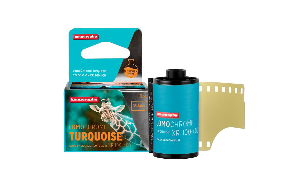
A DIY Approach with Tony Kemplen and the LomoChrome Turquoise
2 9 Share TweetUK-based photographer and writer Tony Kemplen likes to embrace the more unusual analogue aesthetics, from light leaks, film grain to distorted and saturated colors. He was a big fan of the LomoChrome Turquoise, and, in this interview, he shared some tips on shooting and developing with this unique, color-shifting film.


Hi Tony, thank you for returning to the Lomography magazine, you've shot with the LomoChrome Turquoise quite a lot in the past, tell us about your thoughts on this film?
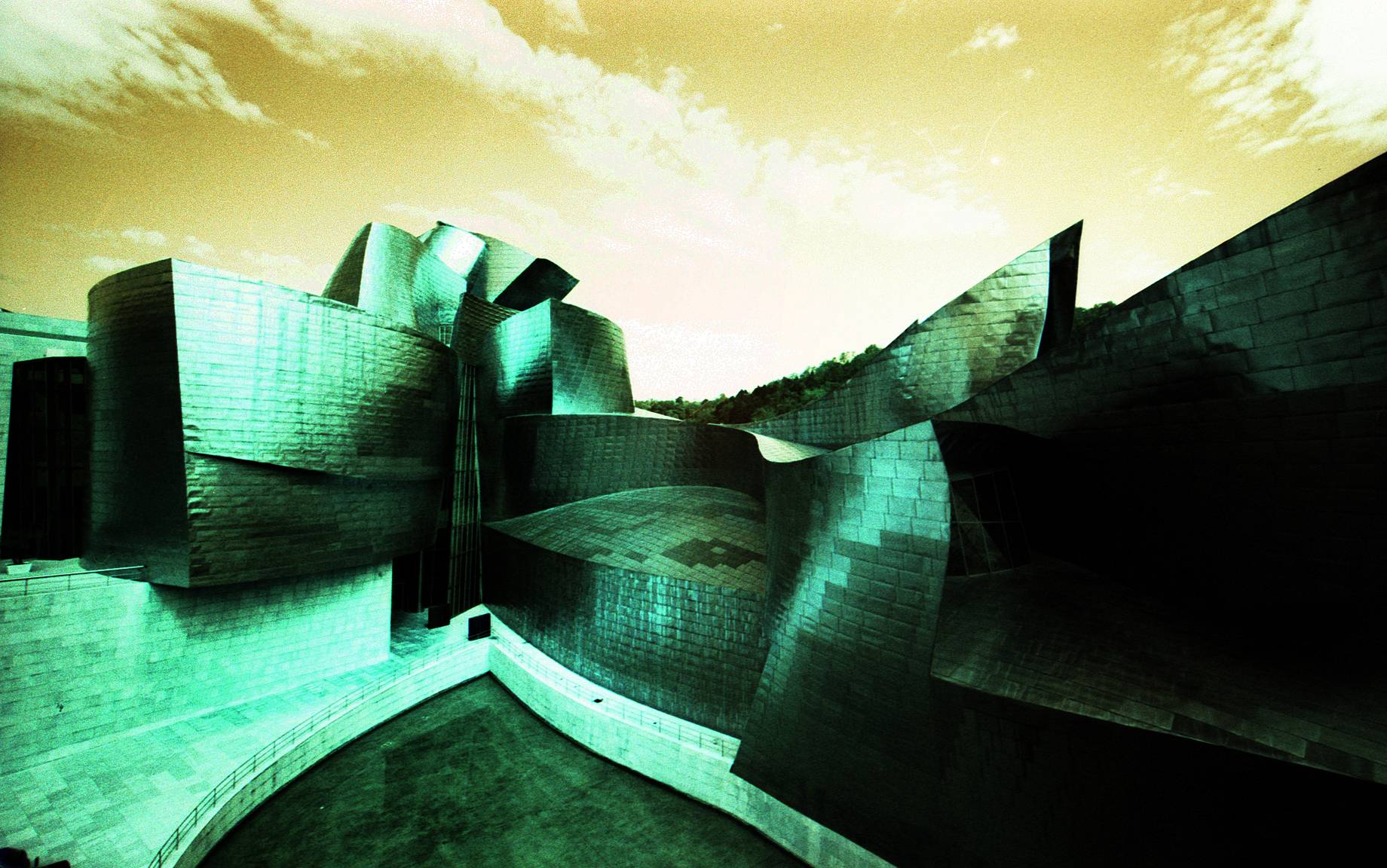
I'm quite a fan of using films that give “non-natural” appearances, such as redscale, cross-processing, and LomoChrome Purple, so when the Turquoise version was launched a few years back I knew I would have to give it a try. I liked the Purple, but for me, the Turquoise really hit the sweet spot. Sometimes it resembles the look you can get with color infrared film, but as that is either not available, or is prohibitively expensive, the LomoChrome Turquoise makes a reasonable alternative. You never quite know what to expect, and I was amused to see one of Lisbon's iconic yellow funicular trams, had taken on a radical new shade!


You've used this film in lots of different cameras and settings, do you notice a difference in the results using different cameras and which results were your favorites?
In terms of the color shifts, there's no difference between cameras, but the effect can vary according to the subject, so with a wide-angle camera like the Lomo LC-Wide, there's scope for there to be a lot of the sky, which is rendered in various hues of orange by the LomoChrome Turquoise. As with most C41 films, there seems to be plenty of latitude when it comes to exposure, so it worked just as well in the ultrabasic Bencini Koroll 24 camera as in the Ricoh R1 with its sophisticated automatic electronic exposure system. I think my favorite LomoChrome Turquoise photos were taken with the Lomo LC-Wide, but that's probably as much down to the camera as the film.

Do you develop these yourself, if "yes" how did you find the process, any processing tips for this film?
I develop all my film using the Tetenal C41 kit. As LomoChrome Turquoise is a C41 film, I just process it as normal. If you've ever developed your own black and white film, I'd encourage you to try the move to color. I was put off using it for years because color photography was said to be hard work, but when my hand was forced by the closure of my local minilab, I took the plunge and found it no harder than black and white processing. The DIY approach probably lacks the consistency of lab work, but let's face it, one of the joys of Lomography is the happy accident, and with a film like LomoChrome Turquoise, no one is going to complain about lack of true color rendition.


What general tips and advice would you give for someone shooting their first roll of LomoChrome Turquoise?
In general, with any new film, I'd recommend shooting a range of subjects in a range of lighting conditions, that way you can get a feel for how it performs in different settings. If your camera is manual, or allows exposure compensation, I'd try a few shots which are deliberately under or overexposed to see what effect this has. If you want to flag up the quirky color shifts, I suggest including something of known color, like daffodils or bananas, as this will make the viewer sit up and take notice! In my experience landscapes aren't particularly favored by the LomoChrome Turquoise look, greens tend to be least affected by the color shifts, while anything with lots of blues and yellows will look distinctly weird (hopefully in a good way).
To see more of Tony's work visit his Flickr and Instagram page.
2021-11-29 #gear #people #lomochrome-turquoise #tony-kemplen


2 Comments